
Discover What You Can Build
500+ workshops, Techniques, and Resources Inside Standout Squarespace
Explore the library of techniques, templates, and resources available for you inside Squarestylist’s Standout Squarespace program.
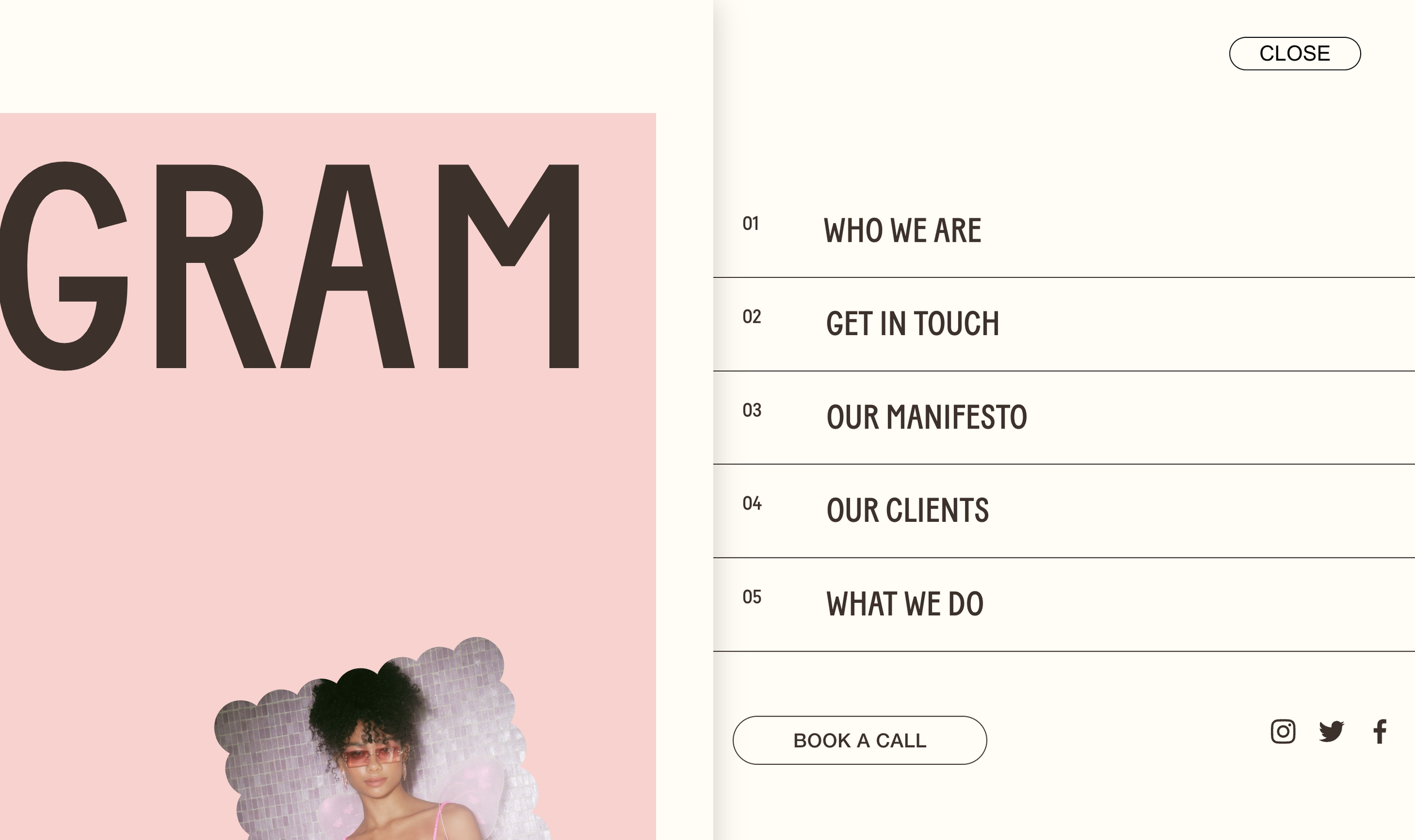
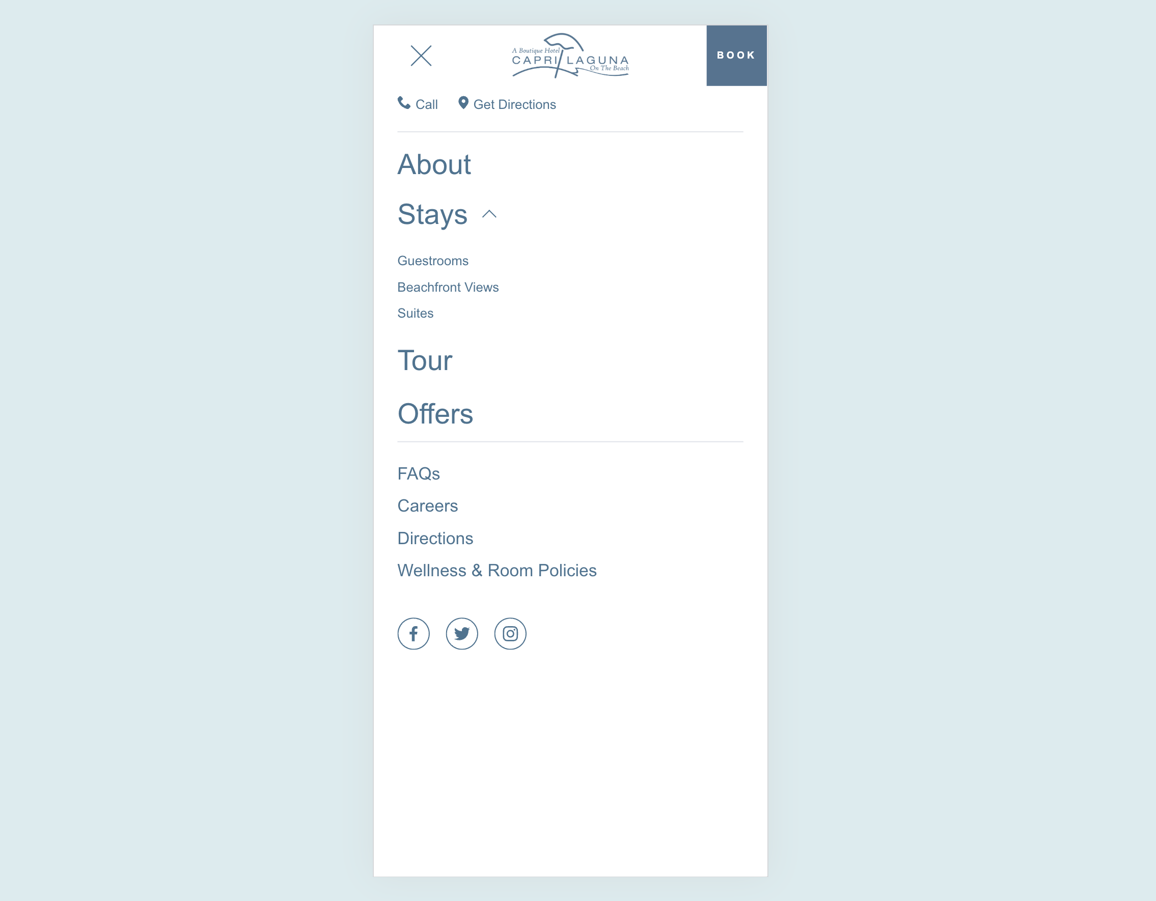
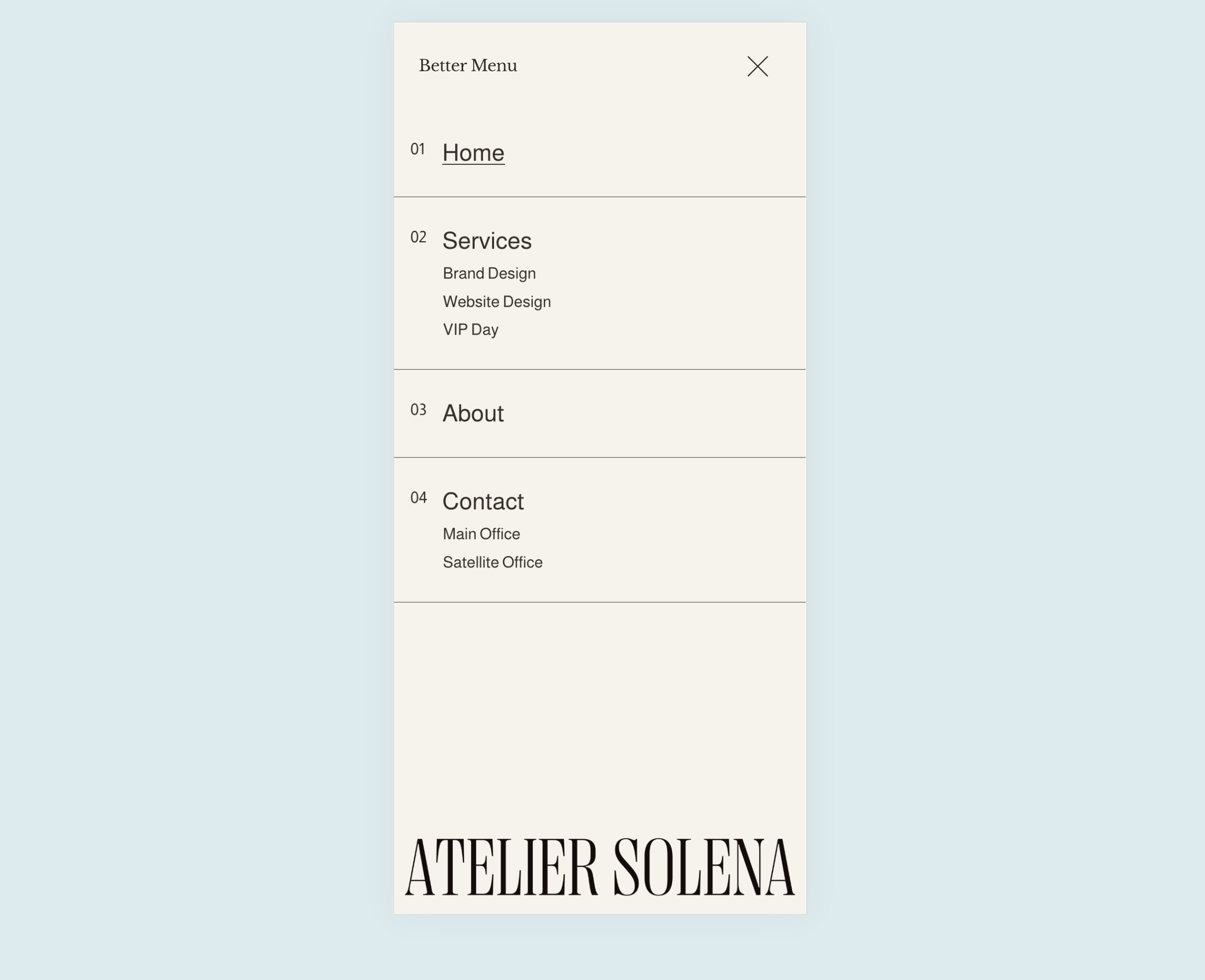
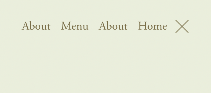
Push Slide-Out Menu
Menu that slides in while page content pushes aside with shadow depth. Numbered menu items, MENU/CLOSE pill button, smooth half-second transitions. Premium navigation feel.
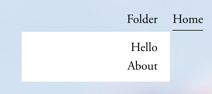
Clickable Folder Navigation Titles
Make folder navigation titles function as clickable links to landing pages while still revealing dropdown menus on hover.

Pop-out Navigation Menu
Replace standard navigation with an elegant slide-out menu system featuring dual content panels, custom hamburger icons, and smooth transitions.
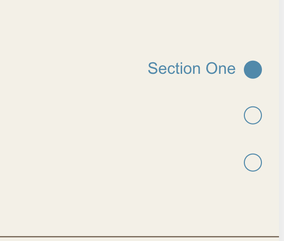
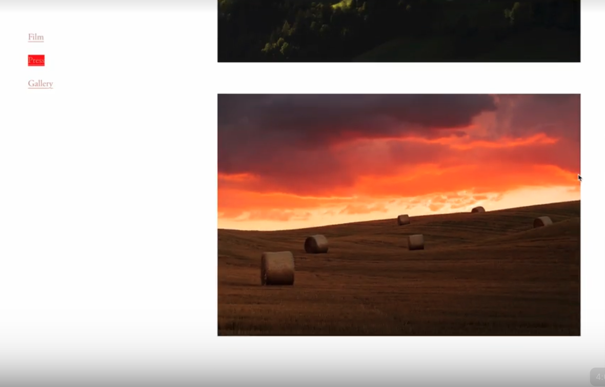
Dot Navigation for Sections
Create a fixed sidebar dot navigation that tracks scroll position and highlights the currently visible section, with smooth scroll-to-section functionality.

Scroll Down Arrow Indicator
A fixed arrow at the bottom of the viewport encourages scrolling and clicking it smoothly scrolls to the next section - perfect for immersive hero experiences.
Highlight Active Navigation Link
Navigation links automatically highlight when visitors are on the corresponding page, providing clear visual feedback about their current location.
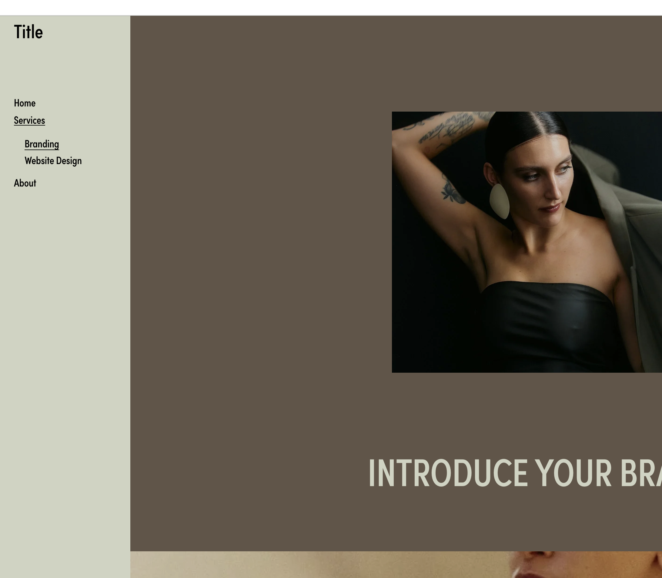
Custom Mobile Menu
Design a completely custom mobile menu using Squarespace's visual editor - add images, buttons, and any layout you want for a branded mobile experience.
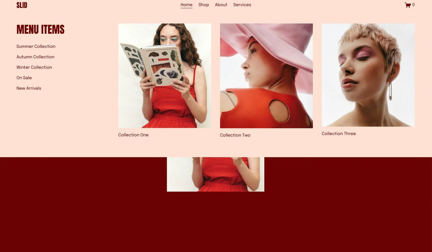
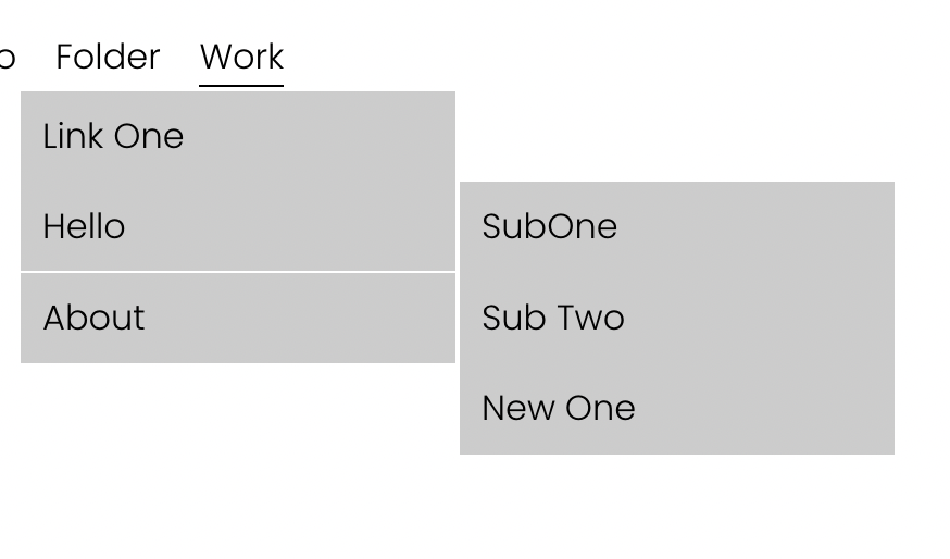
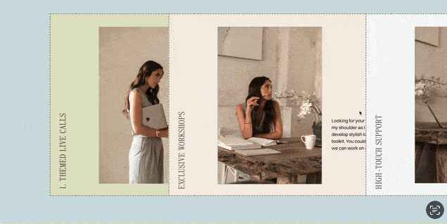
Flexible Mega Menu
Create rich dropdown menus with images, text, and custom layouts - design each panel visually in Squarespace, then display them in polished mega menu dropdowns.

Slide-Out Push Menu
Full-screen menu that pushes page content aside - create that premium, app-like navigation with dramatic slide effects.
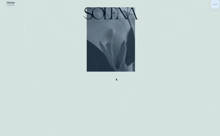
Animated Logo on Scroll
Logo starts large and centered, then animates to header position on scroll - cinematic brand entrances.
Active Menu on Scroll
Navigation links highlight automatically based on which section is currently visible - scroll-based wayfinding.
Enhanced Mobile Menu
Reorganized mobile navigation with proper folder nesting, numbered counters, and decorative elements - polished mobile UX.
Fixed Sidebar Navigation
Vertical sidebar nav with expanded folders - fixed left side of screen.
Two-Level Dropdown Navigation
Nested dropdown menus with secondary submenu sliding out from primary items.
Sideways Vertical Navigation
Fixed sidebar nav with rotated text - vertical writing mode for unique style.
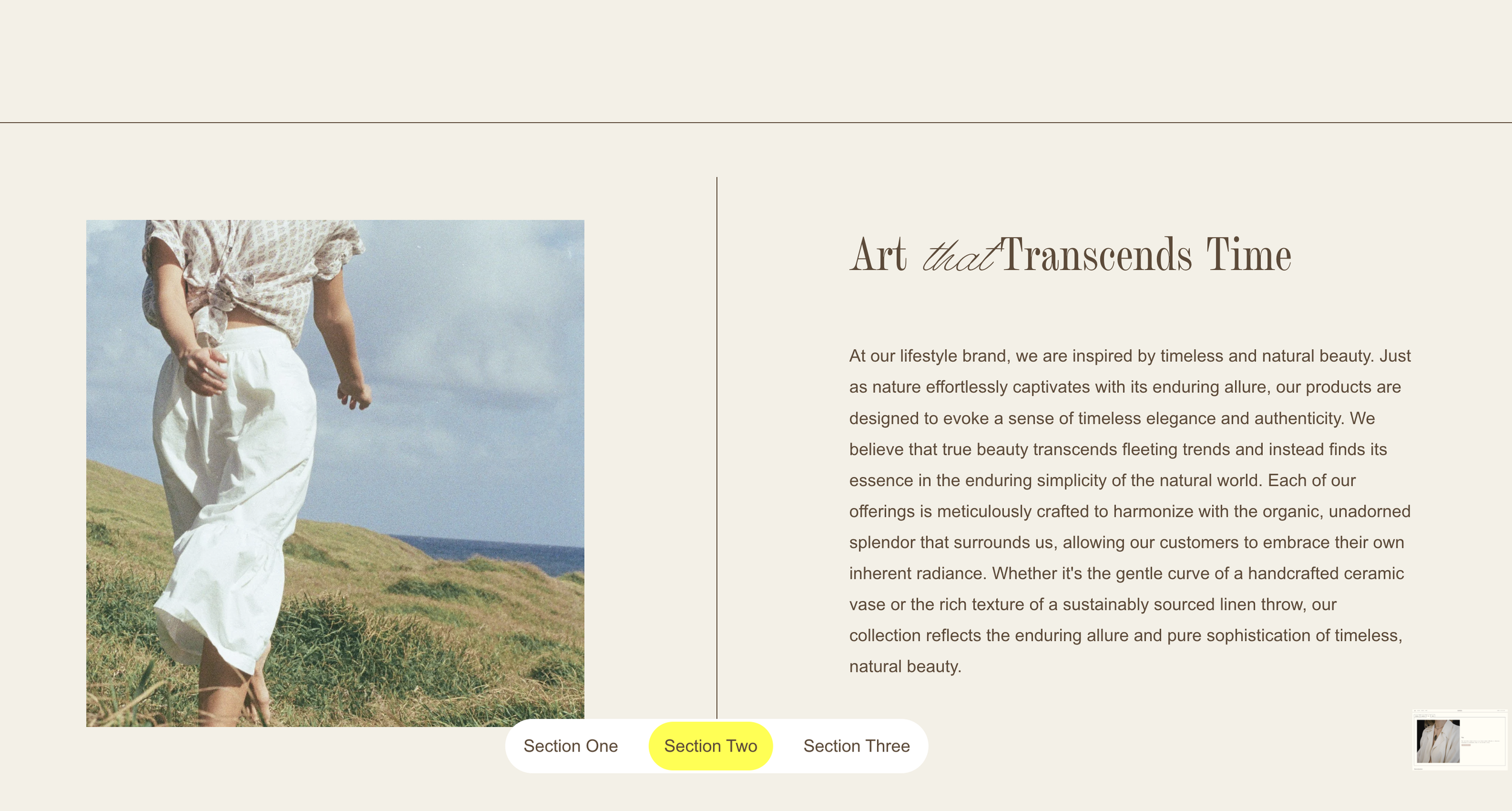
Fixed Index Navigation Bar
Pill-shaped fixed nav at bottom center - highlights active section on scroll.
Simple Mega Menu from Footer
Full-width mega menu pulled from footer section - reveals on folder hover.
Toggle Desktop Navigation with Burger Menu
Hide desktop navigation and reveal with burger menu click.
Custom Mobile Menu Breakpoint
Control exactly when desktop navigation switches to mobile hamburger menu.
Side Swipe Pages with Vertical Tabs
Create horizontally swiping pages triggered by vertical tab navigation.