
Toggle Desktop Navigation with Burger Menu
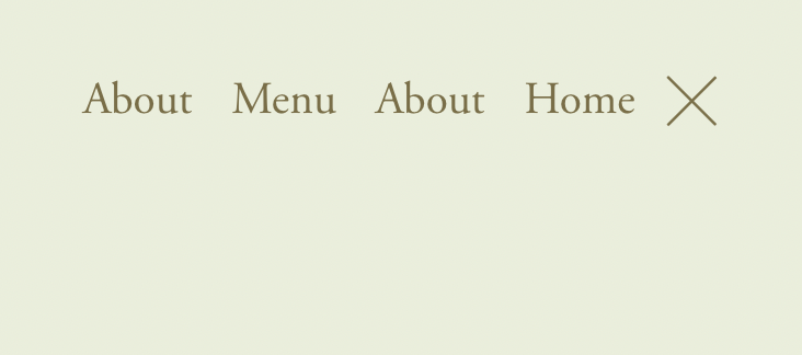
What You'll Create
Desktop navigation that hides by default and slides in when the burger menu is clicked, mimicking mobile menu behavior on larger screens.
The Problem It Solves
Some designs call for minimal headers with hidden navigation. This technique uses the burger icon on desktop to reveal navigation with smooth slide animations.
Perfect For
Minimalist designs, Full-screen hero layouts, Photography sites, Creative portfolios, Luxury brands.
What Makes This Different
CSS translate property slides navigation off-screen by default. The header--menu-open class triggers the reveal transition when burger is clicked.
Details
Section Type: Fluid Engine
Code Type: CSS
Prerequisites: None
Toolkit Title: Show & Hide Desktop Nav
Learn This Technique
This is one of 150+ code techniques taught inside Standout Squarespace, where you get:
The complete, copy-paste code
Video walkthrough explaining how it works
The principles behind the technique so you can customize it
Access to our private community for support